The problem
Nobody designs a help centre. It accumulates.
On’s had grown article by article, arranged the way the company was arranged, which is not how anyone looks for help. People couldn’t find answers, so they opened tickets instead. On a phone, where most of them were, it was worse.
Rebuilding the hierarchy
I audited the articles first: what existed, what said the same thing twice, what was missing entirely.
Then the structure got rebuilt around what people actually typed into the search box. Not around which internal team owned the topic. Those two orders have almost nothing in common, and only one of them helps a customer.
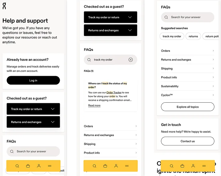
Mobile came first, because that’s where the traffic was and where the old layout failed hardest. Someone standing in a shop with a question needs the answer on one screen, not a category tree to climb.
Desktop
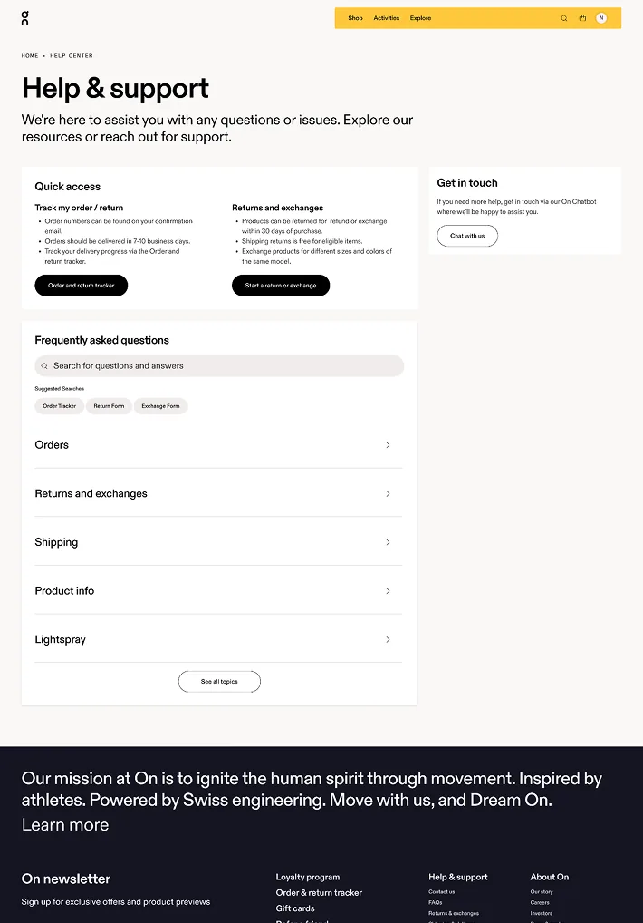
Desktop has room, so it spends it: quick access shortcuts, search with suggested queries, topic categories, and an obvious way to reach a person. All of it visible before you scroll.
What changed
Navigation and discoverability improved, and the self-service resolution rate went up. Fewer people had to open a ticket to get an answer that was already written down somewhere.
What I took from it
A help centre is an information architecture problem wearing a content costume. Reorganising around how customers search did more than any visual change could have.